Building technical documentation, knowledge bases, and developer portals used to be straightforward. You snapped a screenshot, cropped the borders, dropped the image into your markdown file, and published the update.
That workflow quietly broke the moment dark mode became an industry standard.
According to developer ecosystem surveys, over eighty percent of software engineers and technical professionals now keep their operating systems and code editors in dark mode. Readers expect clean, high-contrast visual experiences that do not strain their eyes during late-night sessions. Yet thousands of system architecture charts, database schemas, and wireframes remain trapped on stark white canvases.
When you embed a glaring white diagram into a dark-themed portal, the visual flow breaks completely. Solving that problem does not require an expensive design suite. It requires an understanding of color inversion and an efficient production workflow.
The Unseen Overhead of Dual-Theme Visuals
Modern digital publishing platforms must support responsive dark and light themes. While vector icons and CSS styling handle interface components smoothly, raster assets like PNG diagrams and terminal captures create an ongoing bottleneck for content teams.
When White Backgrounds Ruin Dark Mode Documentation
Most architectural diagrams are drafted in tools with default white canvases. When writers export those diagrams and embed them directly into dark-themed documentation hubs, they produce harsh, glowing white rectangles.
This is more than an aesthetic nuisance. Research from the Nielsen Norman Group shows that extreme brightness contrast—such as moving from a dark background to a harsh white graphic—increases visual fatigue and slows reading comprehension. Readers must repeatedly adjust their focus as they scroll through an article, leading to cognitive fatigue and higher bounce rates.
The Heavyweight Editor Bottleneck
The traditional method for fixing a mismatched diagram involves several cumbersome steps. A writer must open a heavy desktop program like Photoshop or GIMP, wait through the loading screen, import the asset, locate the negative color filter, and re-export the file.
When you need to adjust a single graphic, this process takes a couple of minutes. When you are updating an entire documentation library with hundreds of API diagrams, that overhead turns into days of repetitive manual work. Desktop creative suites are designed for complex digital painting and photo retouching, not for rapid color swaps on monochrome line art.
Understanding Color Inversion Beyond Photo Negatives
Inverting an image is often associated with film photography or artistic negative effects. In digital workflows, however, it is a straightforward mathematical operation across the RGB color spectrum.
To invert a pixel, the computer takes the maximum possible color value of 255 and subtracts the current red, green, and blue values. Pure black pixels with zero values become pure white pixels with values of 255, while pure white pixels invert into solid black.
When applied to monochrome or high-contrast graphics, this mathematical shift delivers practical utility across several technical areas.
How Mathematical Inversion Saves Legacy Diagrams
Black lines drawn on a white canvas cleanly invert into white lines on a solid black background.
For circuit schematics, engineering blueprints, and network flowcharts, this means the visual information remains completely intact while the background glare disappears. You do not need to locate the original editable vector project from three years ago. You can take the flat PNG export, run a quick color inversion, and immediately embed an asset that blends naturally into dark interface containers.
Pre-Processing for Machine Vision and OCR Workflows
Color inversion is also a valuable step in optical character recognition and automated document processing pipelines.
Many text recognition models are trained primarily on dark characters against light backgrounds. When an intake system encounters light lettering on a dark surface—such as white serial numbers stamped on dark machinery or white text on street signs at night—recognition accuracy often drops. Running the graphic through an Image Inverter before feeding it to the text parser normalizes the pixel distribution, significantly reducing extraction errors.
Streamlining the Conversion Loop with Dedicated Web Utilities
The ongoing shift toward lightweight, browser-based tools has changed how technical writers and creators prepare their visual assets. Instead of switching between heavy desktop applications, teams now handle routine image modifications directly inside their browser tabs.
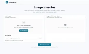
Using a purpose-built utility like Image Inverter removes unnecessary friction. You simply drag your image onto the page, receive the converted asset within seconds, and paste it straight into your content management system.
Eliminating the Desktop Software Bottleneck
The primary advantage of a dedicated online tool is speed. Content production depends on steady momentum. Every time a writer leaves their text editor to launch an external graphic application, their focus is interrupted.
A browser-native image inverter functions like a lightweight utility tool. It carries out a single task with zero setup requirements, allowing technical creators to maintain their writing rhythm without unnecessary interruptions.
Privacy and Client-Side Browser Processing
For internal product teams and enterprise companies, security policies often prohibit uploading proprietary schematics or unreleased user interface mockups to third-party cloud servers.
Modern browser utilities address this concern by processing the pixel transformation locally on the user’s device using client-side canvas technology. Because the image file is processed in local memory and never transmitted across external networks, teams gain the convenience of a web utility alongside the data privacy of a native offline tool.
Practical Rules for Inverting Production Assets
While color inversion is fast, using it indiscriminately can lead to awkward visual results. Understanding which graphics benefit from inversion helps maintain high visual quality across your publications.
Preserving Legibility Across Line Art and Icons
Color inversion is most effective when applied to assets with simple, high-contrast layouts:
- Monochrome wireframes: Inverting changes harsh black outlines into crisp white paths that sit comfortably on dark slate backgrounds.
- Command line captures: Black text on white terminal windows converts instantly into clean dark-mode terminal callouts.
- Whiteboard sketches: Inverting a photograph of a dry-erase board transforms bright room glare into a modern, readable chalkboard aesthetic.
When working with line art, always verify that the original source has strong contrast. If the initial lines are light grey rather than solid black, the inverted lines may appear faint against a dark theme.
Knowing When Not to Invert
Because color inversion reverses all color channels mathematically, red becomes cyan, green turns magenta, and blue shifts to yellow.
Applying global inversion to full-color photographs or branded user interfaces produces distorted results:
- Human portraits end up with unnatural cool-toned skin and discolored eyes.
- Product photography loses its authentic finish and realistic material textures.
- Brand logos and trademarked interface accents violate corporate brand guidelines by displaying reversed hues.
If an asset contains real-world photography, human subjects, or specific brand colors, avoid direct color inversion. In those scenarios, it is better to isolate the background layer manually or place the image inside a subtle framed container.
The Rise of Single-Purpose Micro-Tools in Publishing Workflows
As digital publishing standards evolve, creative workflows are dividing into two clear categories: large creative platforms and hyper-focused micro-utilities.
For comprehensive brand design and complex digital illustrations, full-featured design suites remain essential. But for the daily, recurring adjustments that keep technical documentation readable and visually consistent, focused tools deliver far greater efficiency.
By adding a dedicated image inverter to your publishing toolkit, you eliminate visual glare for dark-mode readers, save valuable editing time, and ensure your technical graphics look intentional across every screen.